Screens View
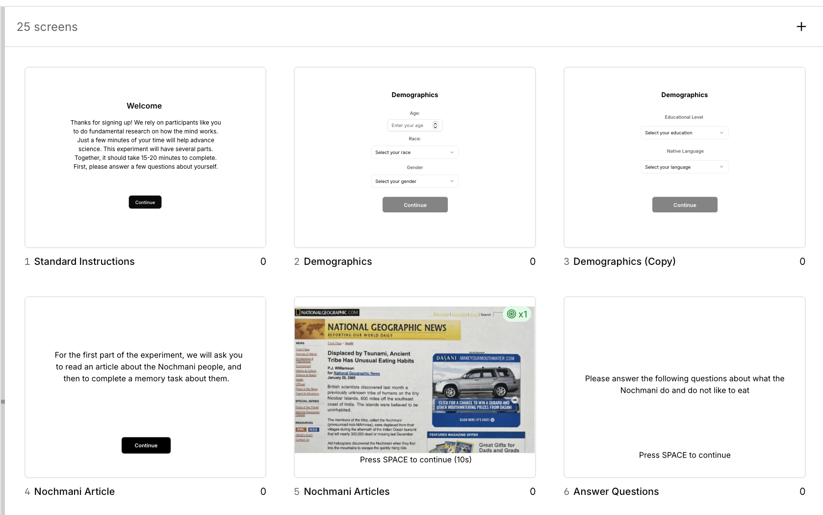
The Screens view is where you visually design what participants see during your experiment. Add text, images, buttons, form fields, and other elements to create exactly the screen you need - from simple instruction pages to complex stimulus presentations.Overview
The Screens view provides a visual canvas editor where you can:- Add and position elements anywhere on the screen
- See exactly what participants will see (WYSIWYG - What You See Is What You Get)
- Configure element properties in real-time
- Create complex, multi-element layouts without coding
- Designing how each component looks visually
- Adding and positioning elements within components
- Configuring visual properties (colors, fonts, sizes)
- Creating custom screen layouts
The Canvas
The canvas is your visual workspace for designing experiment screens.Canvas Features
- Grid-based layout - Snap elements to grid for precise alignment
- Ruler guides - Visual guides for positioning
- Zoom controls - Zoom in for precision, zoom out to see full layout
- Selection tools - Click to select, drag to move, handles to resize
- Multi-select - Select multiple elements to move or align together
Canvas Dimensions
The default canvas is 800px wide × 600px tall, matching standard experimental displays. You can adjust canvas size in the component properties if needed for:- Full-screen displays - For immersive tasks
- Mobile layouts - For smartphone experiments
- Custom sizes - For specific display requirements
Adding Elements
To add an element to your component:- Click the ”+ Element” button on the canvas
- Select the element type from the menu
- The element appears on the canvas
- Drag to position, use handles to resize
- Configure properties in the right panel
Element Library
The element library is organized into categories: Basic Elements:- Text
- Image
- Button
- Shape (rectangle, circle, polygon)
- Fixation Cross
- Line
- Text Input
- Radio Group
- Checkbox Group
- Dropdown
- Likert Scale
- Slider
- Sequential Stimulus (for memory tasks)
- Matrix Response (grids of questions)
- Semantic Differential (bipolar scales)
- Pairwise Comparison
- Ranking Response
- Hotspot Response (clickable image regions)
- Grid Layout (container for organized elements)
- Split Screen (two-panel layouts)
- Countdown Timer
Configuring Elements
Each element type has specific properties you can configure. Select an element on the canvas to see its properties in the right panel.Text Elements
Text elements display words, sentences, or paragraphs. What they’re for:- Instructions and explanations
- Questions in questionnaires
- Stimulus words (e.g., Stroop tasks)
- Feedback messages
- Labels and headers
- Click ”+ Element” → Select “Text”
- Double-click the text element to edit content
- Type your text
- Configure formatting in properties panel
- Text content - The actual text to display
- Font family - Arial, Times New Roman, Courier, etc.
- Font size - In pixels (typical: 16-48px)
- Font weight - Normal, bold, extra bold
- Color - Text color (use color picker or hex codes)
- Alignment - Left, center, right, justify
- Line height - Spacing between lines
- Letter spacing - Space between characters
- Instructions: 18-20px, center-aligned, dark gray on white
- Stimulus words: 36-48px, bold, center-aligned
- Questions: 16-18px, left-aligned for readability
- Feedback: 24px, bold, centered, colored (green/red)
- Use high contrast for readability (e.g., black text on white background)
- Center-align for single words or short phrases
- Left-align for paragraphs and longer text
- Test font sizes on actual display devices
Image Elements
Image elements display pictures, diagrams, or visual stimuli. What they’re for:- Visual stimuli (faces, objects, scenes)
- Diagrams and illustrations
- Icons and symbols
- Background images
- Example stimuli in instructions
- Click ”+ Element” → Select “Image”
- Click “Select Image” in properties panel
- Choose from media library or upload new image
- Resize and position on canvas
- Image source - Select from uploaded media library
- Fit mode - How image fills the element bounds:
- Contain - Entire image visible, may have letterboxing
- Cover - Fills entire element, may crop edges
- Fill - Stretches to fit (may distort aspect ratio)
- Scale-down - Original size or smaller to fit
- Width & height - Element dimensions
- Opacity - Transparency (0-100%)
- Border - Optional border around image
- Border radius - Rounded corners
- Face stimuli: 300×400px, contain mode, centered
- Object images: 200×200px, contain mode
- Background images: Full canvas, cover mode, 30% opacity
- Icons: 48×48px or 64×64px, contain mode
- Upload images in the correct dimensions to avoid quality loss
- Use consistent image sizes for all stimuli in a task
- Use “contain” mode to preserve aspect ratio
- JPG for photographs, PNG for graphics with transparency
- Optimize image file sizes for faster loading
Button Elements
Button elements collect responses through on-screen clicks. What they’re for:- Response collection in button-based tasks
- “Continue” or “Next” navigation
- Multiple choice selections
- Consent acknowledgment
- Form submission
- Click ”+ Element” → Select “Button”
- Set button text in properties panel
- Configure appearance and behavior
- Button text - Label shown on button
- Button color - Background color
- Text color - Label text color
- Border - Border style and color
- Border radius - Rounded corners (0 = square, high value = pill shape)
- Padding - Space around text inside button
- Action - What happens when clicked:
- Continue to next component - Advances experiment
- Submit response - Records button choice
- Custom action - Advanced behaviors
- Primary buttons: Blue background (#0EA5E9), white text, 8px radius
- Secondary buttons: Gray background, dark text, 6px radius
- Navigation buttons: “Continue” text, centered, medium size
- Response buttons: Equal sizes, spaced evenly, labeled clearly
- Make buttons large enough for easy clicking (minimum 44×44px)
- Use contrasting colors for button background and text
- Label buttons clearly (“I Consent”, “Next”, “Submit”)
- Space multiple buttons evenly (e.g., “Yes” and “No” options)
- Consider accessibility - button text should describe action
Form Elements
Form elements collect structured data from participants.Text Input
Free-text entry fields for open-ended responses. What they’re for:- Open-ended survey questions
- Demographics (name, occupation)
- Creative tasks (word generation)
- Memory recall responses
- Comments and feedback
- Placeholder - Gray hint text before input
- Default value - Pre-filled text (usually empty)
- Max length - Character limit
- Required - Must be filled before continuing
- Validation - Pattern matching (email, numbers, etc.)
- Multi-line - Single line vs. text area
- Short answer: Single line, 300px wide, required
- Essay: Multi-line, 500px wide × 200px tall
- Email: Email validation pattern, required
- Demographics: Appropriate validation for each field
Radio Group
Single-choice selection from multiple options. What they’re for:- Multiple choice questions (select one)
- Yes/No questions
- Agreement scales (Agree/Neutral/Disagree)
- Categorical demographics (gender, education level)
- Single-answer surveys
- Options - List of choices (add, remove, reorder)
- Option labels - Text shown for each choice
- Layout - Vertical list or horizontal row
- Required - Must select one option
- Default selection - Pre-selected option (usually none)
- Yes/No questions: 2 options, horizontal layout
- Likert items: 5-7 options, horizontal or vertical
- Demographics: Vertical list for readability
Checkbox Group
Multi-select options where participants can choose multiple items. What they’re for:- “Select all that apply” questions
- Interest/preference surveys
- Symptom checklists
- Multi-answer quizzes
- Feature selections
- Options - List of choices
- Option labels - Text for each checkbox
- Layout - Vertical or horizontal
- Min selections - Minimum required selections
- Max selections - Maximum allowed selections
- Required - Must select at least one
- General checklists: Vertical layout, no limits
- Choose up to 3: Max 3 selections enforced
- Required multi-select: Min 1 selection
Dropdown
Select menu for choosing from a long list of options. What they’re for:- Country/state selection
- Year/month selection
- Long lists of categories
- Compact single-choice questions
- Reducing screen space for many options
- Options - List of choices in dropdown
- Placeholder - Text shown when nothing selected
- Default selection - Pre-selected option
- Required - Must select an option
- Searchable - Allow typing to filter options (for long lists)
- Country selector: All countries, searchable, required
- Age selection: Years 18-100, required
- Category selection: 10-20 options, placeholder “Select…”
Likert Scale
Agreement or frequency rating scales. What they’re for:- Survey questionnaires
- Attitude measurements
- Agreement scales (Strongly Disagree to Strongly Agree)
- Frequency scales (Never to Always)
- Rating tasks
- Number of points - Typically 5, 7, or 9 points
- Labels - Text for endpoints and optionally midpoint
- 5-point: “Strongly Disagree” to “Strongly Agree”
- 7-point: 1-7 with endpoint labels
- Frequency: “Never” to “Always”
- Show numbers - Display numeric labels (1, 2, 3…)
- Orientation - Horizontal or vertical
- Required - Must select a point
- Standard Likert: 5 points, horizontal, endpoint labels
- Bipolar scale: 7 points, opposing adjectives at ends
- Frequency scale: 5 points, “Never” to “Always”
Slider
Continuous response scales for ratings. What they’re for:- Continuous ratings (0-100)
- Analog scales
- Confidence ratings
- Probability judgments
- Visual analog scales (VAS)
- Min value - Lowest value (typically 0)
- Max value - Highest value (typically 100)
- Step - Increment size (1 for discrete, 0.1 for continuous)
- Default value - Starting position
- Show value - Display current numeric value
- Labels - Text at endpoints
- Required - Must move slider from default
- 0-100 rating: Min 0, max 100, step 1, show value
- Confidence: “Not Confident” to “Very Confident” labels
- Continuous VAS: Step 0.1 for smooth movement
- Forced response: No default, required to move
Specialized Elements
Sequential Stimulus
Display stimuli in rapid succession (digit span, RSVP). What it’s for:- Digit span memory tasks
- Rapid Serial Visual Presentation (RSVP)
- Memory encoding sequences
- Visual working memory tasks
- Stimuli list - Array of items to show sequentially
- Duration per item - How long each shows (e.g., 500ms)
- Inter-stimulus interval - Blank time between items
- Mask - Optional pattern mask between items
- Digit span: 7 digits, 500ms each, 200ms ISI
- RSVP: 100-200ms per word, minimal ISI
Matrix Response
Grid of questions × response options for efficient surveys. What it’s for:- Battery of similar questions
- Rating multiple items on same scale
- Compact survey layouts
- Multi-item questionnaires
- Row labels - Questions or items to rate
- Column labels - Response options (Never to Always)
- Required rows - Which items must be answered
- Layout - Spacing and alignment
- Symptom checklist: 10 symptoms × 5-point frequency scale
- Item ratings: 8 items × 7-point Likert scale
Semantic Differential
Bipolar adjective scales (Happy/Sad, Fast/Slow). What it’s for:- Perception and attitudes
- Brand personality research
- Emotional ratings
- Bipolar constructs
- Left adjective - One pole (e.g., “Happy”)
- Right adjective - Opposite pole (e.g., “Sad”)
- Number of points - Usually 7
- Multiple scales - List of bipolar pairs
- 7-point scales: Good/Bad, Strong/Weak, Active/Passive
- Emotion ratings: Happy/Sad, Calm/Anxious
Pairwise Comparison
Compare two stimuli or options side-by-side. What it’s for:- Preference judgments
- Similarity ratings
- Forced choice tasks
- Comparative evaluations
- Left stimulus - First option
- Right stimulus - Second option
- Question - What to compare (“Which is larger?”)
- Response method - Click left/right or keyboard keys
Ranking Response
Drag-to-rank items in order of preference or importance. What it’s for:- Preference rankings
- Priority ordering
- Importance ratings
- Sort tasks
- Items - List of things to rank
- Instructions - How to rank (most to least important)
- Allow ties - Whether items can have same rank
Hotspot Response
Define clickable regions on images for response collection. What it’s for:- Spatial attention tasks
- Image-based responses
- Visual search
- Region-of-interest tasks
- Base image - Background image
- Hotspot regions - Defined clickable areas
- Region labels - Names for each hotspot
- Feedback - Show correct/incorrect regions
Grid Layout
Container for organizing elements in rows and columns. What it’s for:- Multi-stimulus displays
- Organized form layouts
- N-item memory arrays
- Structured presentations
- Rows - Number of rows
- Columns - Number of columns
- Gap - Spacing between cells
- Alignment - How content aligns in cells
Split Screen
Divide screen into two panels for dual-task or comparison displays. What it’s for:- Dual-task paradigms
- Side-by-side comparisons
- Instructions + example displays
- Two-stream attention tasks
- Split orientation - Vertical (left/right) or horizontal (top/bottom)
- Split ratio - 50/50 or custom proportions
- Panel content - Elements in each panel
Countdown Timer
Display remaining time during timed tasks. What it’s for:- Timed sections
- Performance pressure tasks
- Time-limited responses
- Deadline indicators
- Duration - Total time to count down from
- Format - Display as MM:SS or seconds
- Color change - Visual indication when time running out
- Sound - Optional beep when time expires
Element Properties Panel
When you select an element on the canvas, the Properties Panel appears on the right side showing all configurable properties for that element.Common Properties (All Elements)
Every element has these basic properties:- Position - X and Y coordinates on canvas
- Size - Width and height in pixels
- Z-index - Layering order (higher numbers appear on top)
- Opacity - Transparency (0% = invisible, 100% = solid)
- Rotation - Angle in degrees (0-360)
- Visibility - Show or hide element
- Conditional display - Show only if condition met
Element-Specific Properties
Each element type has unique properties relevant to its function:- Text: Font, size, color, alignment
- Image: Source, fit mode, border
- Button: Text, colors, action
- Forms: Validation, requirements, options
- Specialized: Configuration specific to element type
Property Groups
Properties are organized into collapsible sections:- Layout - Position, size, alignment
- Appearance - Colors, fonts, borders
- Behavior - Actions, validation, responses
- Advanced - Conditional logic, custom settings
Positioning and Layout
Create professional, aligned layouts with these positioning tools.Absolute Positioning
Place elements at specific X, Y coordinates:- X coordinate - Distance from left edge (in pixels)
- Y coordinate - Distance from top edge (in pixels)
- Precise control - Exact positioning for pixel-perfect layouts
Center Alignment
Automatically center elements:- Center horizontally - Centers on X-axis
- Center vertically - Centers on Y-axis
- Center both - Perfect centering on canvas
- One-click centering - No manual calculation needed
Grid and Guides
Use visual aids for alignment:- Snap to grid - Elements snap to grid lines when moving
- Show grid - Toggle grid visibility
- Ruler guides - Drag guides from rulers for custom alignment
- Smart guides - Appear when edges align with other elements
Layering (Z-Index)
Control which elements appear on top:- Z-index value - Higher numbers = on top
- Bring to front - Move element to top layer
- Send to back - Move element to bottom layer
- Bring forward / Send backward - Move one layer at a time
Rotation and Opacity
Advanced positioning features:- Rotation - Rotate element 0-360 degrees
- Use for: Tilted text, oriented arrows, diagonal lines
- Opacity - Make elements semi-transparent
- Use for: Background images, watermarks, overlays
Alignment Tools
Align multiple selected elements:- Align left - Align left edges
- Align right - Align right edges
- Align top - Align top edges
- Align bottom - Align bottom edges
- Align center - Align centers (horizontal or vertical)
- Distribute evenly - Space elements equally
Spacing and Padding
Control space around and between elements:- Margin - Space outside element
- Padding - Space inside element (for containers)
- Gap - Space between child elements (for layouts)
Tips and Best Practices
When to Use Which Element Type
For displaying information:- Text - Instructions, questions, labels
- Image - Pictures, diagrams, visual stimuli
- Shape - Backgrounds, dividers, highlight boxes
- Button - Simple choices, navigation, consent
- Keyboard response - Fast timed responses
- Text input - Open-ended answers
- Radio/Checkbox - Categorical choices
- Likert/Slider - Rating scales
- Sequential stimulus - Memory encoding
- Matrix - Efficient multi-item surveys
- Hotspot - Spatial attention tasks
- Ranking - Preference ordering
Organizing Complex Screens
For screens with many elements:- Use Grid Layouts - Organize elements in structured rows/columns
- Group related elements - Keep questions with their response fields
- Consistent spacing - Use same margins and padding throughout
- Visual hierarchy - Larger text for important information
- White space - Don’t crowd the screen, leave breathing room
Responsive Design Considerations
Ensure your experiment works across devices:- Test on target devices - Desktop, tablet, mobile
- Avoid fixed pixel sizes - Use percentages where possible for flexibility
- Check font sizes - Ensure text is readable on small screens
- Touch-friendly buttons - Minimum 44×44px for mobile
- Simplified mobile layouts - Reduce elements for small screens
Accessibility Best Practices
Make your experiments accessible to all participants: Color and Contrast:- High contrast - Dark text on light background (or vice versa)
- Don’t rely only on color - Use shapes, labels, or patterns too
- Color-blind friendly - Avoid red-green distinctions
- Test contrast ratios - Use online contrast checkers (aim for 4.5:1 minimum)
- Readable fonts - Sans-serif fonts (Arial, Helvetica) for screen reading
- Adequate size - Minimum 16px for body text
- Line spacing - 1.5× line height for readability
- Avoid all caps - Harder to read, especially for long text
- Clear labels - Describe what buttons and fields do
- Large click targets - At least 44×44px for buttons and links
- Keyboard navigation - Ensure all interactive elements are keyboard-accessible
- Clear focus indicators - Show which element is currently focused
Common Patterns
Consent Form Screen
Typical elements:- Text element - Consent form content (left-aligned, 16-18px)
- Text element - “Do you consent to participate?” (bold, 20px)
- Button element - “I Consent” (primary color, centered)
- Button element - “I Do Not Consent” (secondary color, centered)
Instruction Screen
Typical elements:- Text element - Title (24-36px, bold, centered)
- Text element - Paragraph instructions (18px, left-aligned)
- Image element - Example or diagram (centered)
- Button element - “Continue” (bottom center)
Stimulus Presentation Screen
Typical elements:- Fixation cross element - Center of screen (or shown in previous component)
- Text/Image element - Stimulus (centered, large)
- (Optional) Text element - Response prompt (below stimulus)
Response Collection Screen
Typical elements:- Text element - Question (top or center)
- Radio/Button elements - Response options (centered below question)
- (Optional) Button - “Submit” if not auto-advancing
Feedback Screen
Typical elements:- Text element - “Correct!” or “Incorrect” (large, bold, centered)
- (Optional) Text element - Additional feedback or explanation
- (Optional) Shape element - Background color (green for correct, red for incorrect)
Questionnaire Page
Typical elements:- Text element - Question (top, 18-20px)
- Likert scale element - Response scale
- Text element - Reverse scoring note (if applicable)
Multi-Element Stimulus
For complex displays (e.g., visual search array):- Grid Layout element - Container for stimuli
- Multiple Image/Shape elements - Target and distractors
- Position using grid - Organized, balanced array
Next Steps
Now that you understand the Screens view, explore other views:Flow View
Connect components into experimental sequences
Timeline View
Control timing and trial organization
Variables View
Create trial-by-trial variations
Preview
Test your experiment